See where your solar power goes
Part 7 in Peter Aubourg’s Diary of an EV Driver And now for my fellow solar nerds, some juicy graphs care of the Clipsal Cortex monitoring system that I installed to track production and consumption of the power in our home. The first chart I use...

Part 7 in Peter Aubourg’s Diary of an EV Driver
And now for my fellow solar nerds, some juicy graphs care of the Clipsal Cortex monitoring system that I installed to track production and consumption of the power in our home.
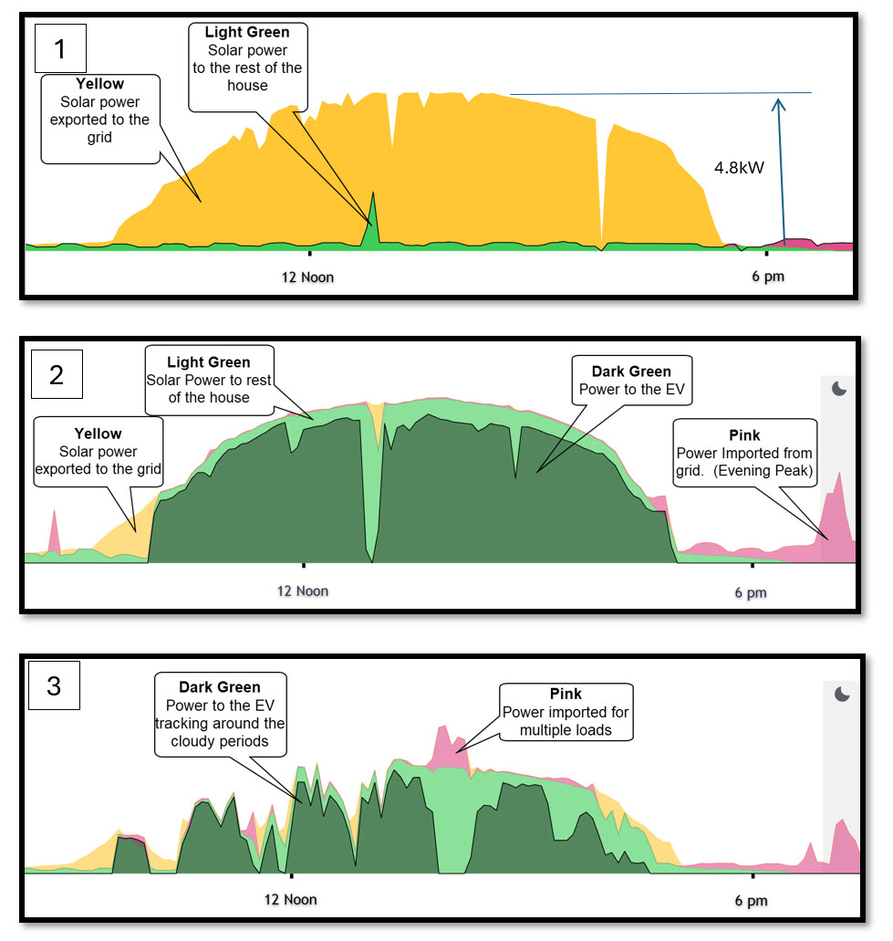
The first chart I use as a reference. This shows the dome-shaped curve of the power generated by the solar panels on a beautiful sunny day when we were out, and almost no power was being used by the house. The yellow indicates solar power that is being exported back to the grid. The light green is solar power that is being used by the home. The jagged shapes on the yellow indicate clouds have come over and interrupted the solar power.
The second chart shows a perfect day for charging the car. No clouds, so a smooth dome-shaped solar graph. The light green shows the loads in the rest of the house and the dark green shows the EV charging, filling in the gaps to consume all of the available solar power.
The tiny yellow triangle at the start of the day is solar power being exported back to the grid, before I had plugged in the charger. The pink is power imported from the grid for the evening peak. You can see how the Evnex car charger continually tracks up and down to feed all the excess solar power into the car battery.
The third graph shows a partly cloudy day when we were using the dishwasher, water heater and stove in the middle of the day. At this time, the car charger had turned off and a small amount of power had to be imported to cover the excess.
A fairly bumpy ride for the car charger that day as it powers up and down around the cloudy periods and the whims of the home owners turning appliances on and off.
This monitoring system allows you to learn the best way to manage various appliances/electrical loads in your house.
After a little while, you can get some good savings by simply turning loads on at different times of the day.


